

Have you ever landed on a website that felt more like a warehouse of random items than a guide to what you actually needed? That was my experience recently when I tried to book tickets for a friend for a devotional dance program online. It should have been simple: I had the pamphlet, I had the website, and I was ready to pay. Instead, I ended up lost and frustrated.
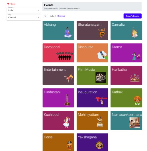
The pamphlet listed a website for online booking, so I went there. The event was nowhere to be found on the homepage. The search gave no results, and the event listing page was just a jumble of categories. After clicking around for a few minutes, I gave up in frustration.
This is a textbook case of poor user experience design. Instead of a clear path to the event’s booking page, I faced endless categories that felt like I was peeking into their back-end database. No user should have to do detective work to find what they came for.
Back when I consulted for ChennaiOnline dot com more than 25 years ago, the founders understood that delivering a seamless “user journey” (Google this term to learn more) was crucial. They spent time educating event organizers to provide a direct, intuitive path from discovery to purchase. Smartphones and QR codes did not even exist then, yet the emphasis was always on convenience, ensuring visitors found what they wanted without any guesswork.
Today, with advanced digital tools readily available, this should be easier than ever. A simple QR code on the pamphlet, for instance, could have taken me straight to the event page. Instead, I called the provided number and got another surprise: the person on the line said tickets were only available at the venue. This completely contradicted the promises made in the pamphlet and on the website. Such disregard for the customer’s time is baffling, especially in a country that has embraced seamless digital payments through UPI and QR codes. We know how easy it is to scan a code and get things done instantly, so why is it so hard to apply the same principle to booking a ticket?
The takeaway is straightforward. If you care about your audience, think through their journey from start to finish. Do not bury them in multiple layers of navigation, and do not send them chasing after information they should have been given upfront. Whether it is an event ticket, a product purchase, or a simple inquiry, the goal is to respect the user’s time and simplify their path.
In short, good UI and UX are not about flaunting technical complexity. They are about empathy—putting yourself in the user’s shoes and ensuring they get where they need to go with minimal effort. If event organizers and businesses remember this, they will keep their customers happy, engaged, and coming back for more.
Discover more from Mangoidiots
Subscribe to get the latest posts sent to your email.