

This week I encountered two examples of how even the giants in e-commerce have a lot towards improving the usability of their apps.
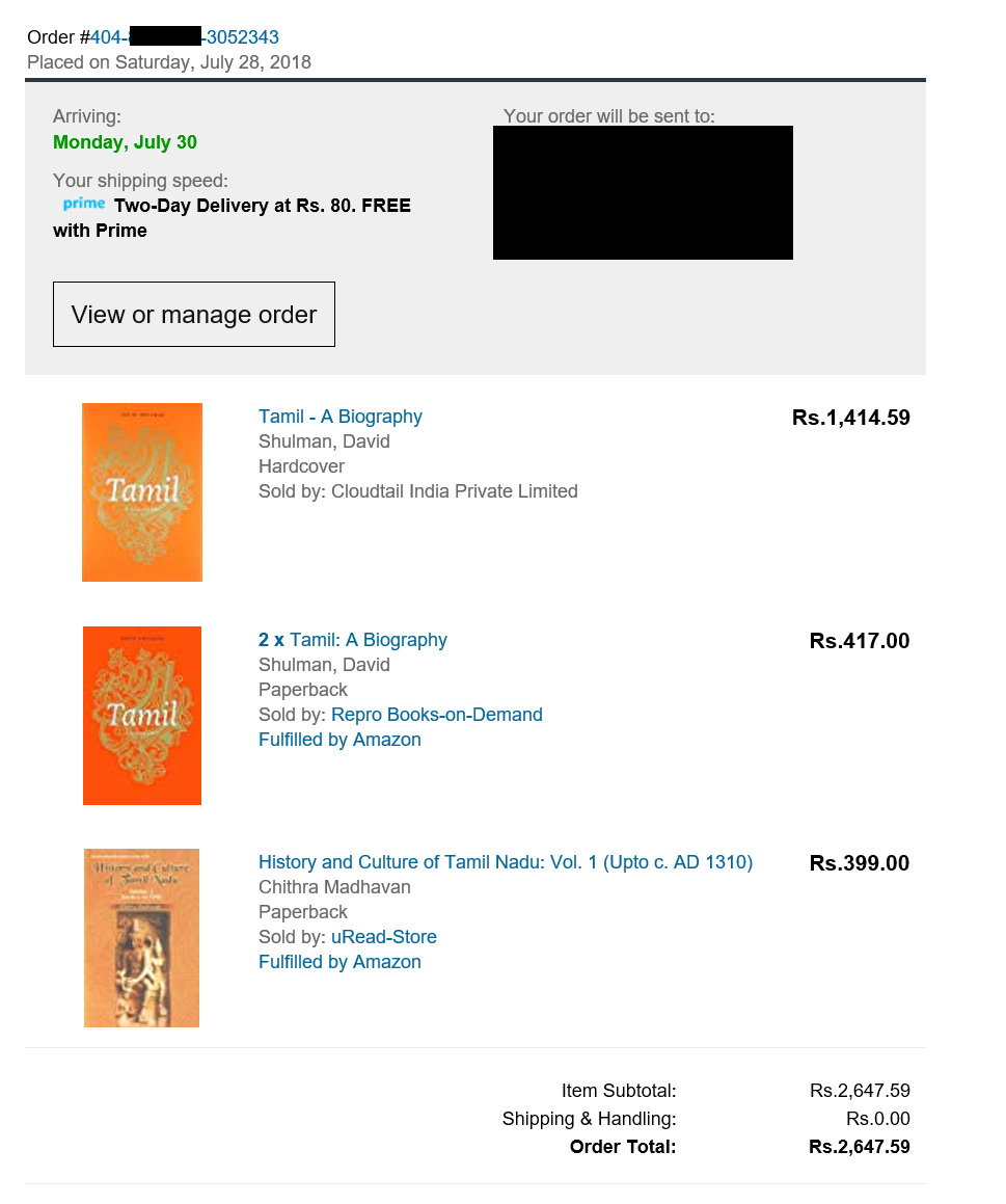
The first was with Amazon India. You expect the Internet juggernaut to have perfected the whole online shopping pipeline, yet I found there was a bug in the invoice that was displayed – Amazon engineers might argue it is a feature, but for me, a consumer it is a bug. The below invoice should be showing for the second item, the amount which should 2 * unit price (₹834), instead it was wrongly showing the unit price (₹417) alone, not taking into account the quantity. I got confused. I have raised a ticket with Amazon support, who have acknowledged the receipt.
The second was with PayTM app. I will appreciate them for giving an option to set daily and monthly transfer limits in the app when most apps don’t bother for your safety. Unfortunately, the defaults are set to “No Limits”. I wish they turn to be a noble soul, and set some value for defaults, it will protect their ordinary users. Their AI backend can optimize it later based on usage. I am sure for most users, even setting the limits to say 3 or 5 transactions and for few thousand rupees will not be a barrier.

On this same topic, I have written a few years ago a post titled “Software design, little has changed in last 70 years“, where I explored whether the way software is designed and developed has it changed from 19 February 1946 when Alan Turing designed the first well-known software for a stored program computer. Outside the area of software, if you want to learn on what goes into designing a usable everyday object, check this example of how Deborah Adler reimagined pill bottles for Target.
Discover more from Mangoidiots
Subscribe to get the latest posts sent to your email.