

கடந்த இரண்டு நாட்களாக கணித்தமிழ்ச் சங்கம் முதல் முறையாக “தமிழ் எழுத்துருவியல் 2015” என்ற கருத்தரங்கத்தை சிறப்பாக நடத்திக் கொண்டிருக்கிறது. மொழியை அச்சிடும் போதும், காட்சிப்படுத்தும் போதும் அம்மொழியின் எழுத்துருக்களை (Typeface, colloquially known as fonts) ஒழுங்கமைக்கின்ற ஒரு கலையாகவும் தொழில்நுட்பமாகவும் விளங்குவது தான் எழுத்துருவியல் – ஆங்கிலத்தில் Typography. பல அறிஞர்கள் இன்றும் பேசினார்கள், அதில் என் நினைவில் இருந்து சிலவற்றை இங்கே பகிர்கிறேன்.
Venkatarangan, Nana, Mani Manivannan
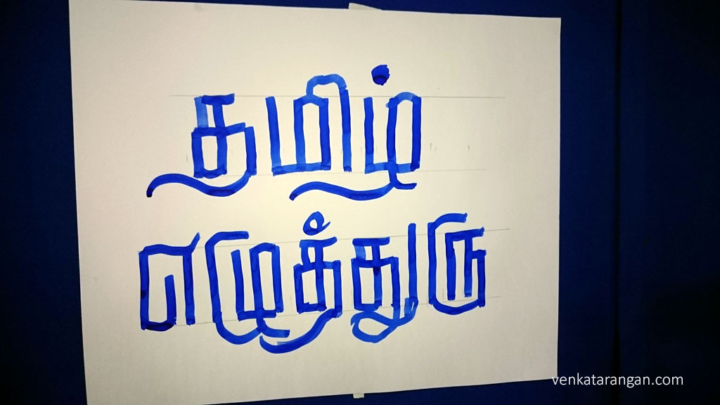
திரு.நானா (தமிழில் பிரபல வடிவமைப்பாளர்) அவர்கள் தமிழ் எழுத்துருக்கள் அச்சு துறையில் எப்படி புதுமையாகப் பலப்பல வடிவங்களில் தலைப்புகளில் எழுதப்பட்டுள்ளது என உதாரணங்களோடு விளக்கினர். தலைப்பு முக்கியம் தான், அதன் எழுத்துருவும் அதே அளவு முக்கியம் என விளக்க நமக்கு வியப்பு. எழுத்தாளர் சுஜாதாவின் பல நாவல்களுக்கு அட்டை வடிவமைத்ததையும் அவர் நினைவுகூர்ந்தார். ஒவ்வொரு சினிமா வரும் போதும் அதோடு அதன் தனித்துவத்தோடு ஒரு எழுத்துருவும் இலவசமாக வெளியிட்டால் தமிழில் பல புதுவகையான எழுத்துருக்கள் மக்களுக்கு கிடைக்கும் என ஒரு யோசனையைச் சொல்லி, அதற்கு அவரும் முயற்சிப்பதாகவும் சொன்னார், மகிழ்ச்சி. திடிரென்று மேடையில் ஒரு வெள்ளை தாளை ஒட்டி Barcode போல நிளநிளமாக கோடுகளைப் போட்டார், பிறகு அந்த தனி தனி கோடுகளை லவகமாக சேர்த்தார், பார்த்தால் “தமிழ் எழுத்துரு” என்று எழுதியிருந்தது, எல்லாம் சில வினாடிகள் தான், அற்புதம்! (காணொலி இங்கே).
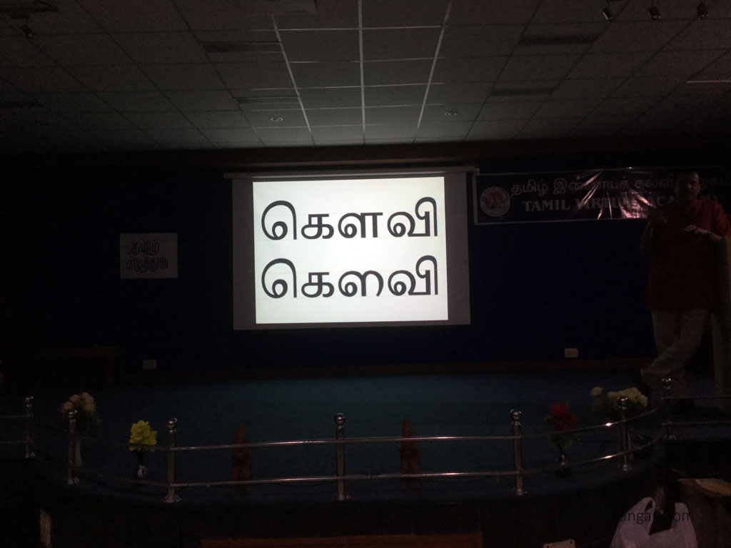
Muthu Nedumaran (Murasu Anjal) talked about the challenges associated with creating South East Asian and Indian language typefaces and the tricks he learned over the years to solve them. He talked of the countless hours he spends to get all the characters in any typeface he designs to be in perfect harmony with each other, no one glyph should stand out in the pack. Similarly in a multi language setting, no one language typeface should stand out from others.

One technique to spot characters not in harmony is to reverse the colour
Muthu asked the august audience to debate and analyse the benefits of coming with an unique glyph for the vowel-consonant for Tamil sound ஔ like in கௌ to differentiate it from vowel and consonant, his suggestion was a glyph like the shown below.
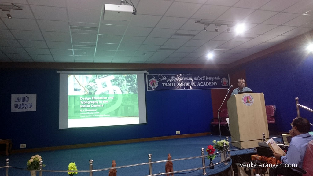
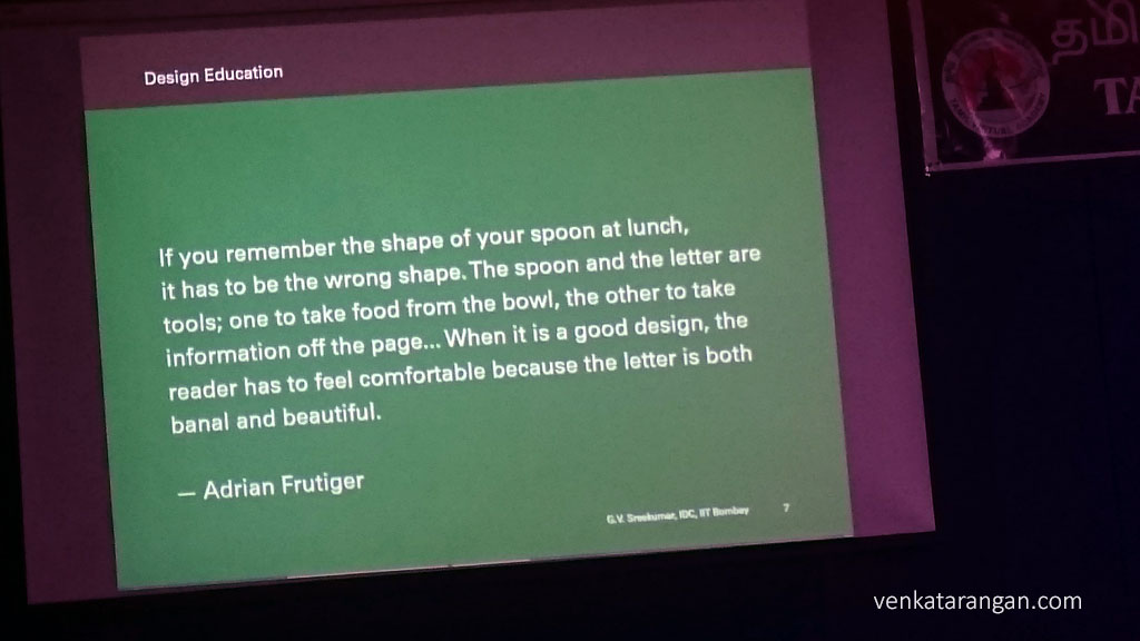
In another talk, Dr.G.V.Sreekumar from IIT Bombay Industrial Design Centre talked about importance of design and simplicity in Typography, what IDC is doing in this regard. In India during British rule, Design in curriculum was introduced that produced Advertisers, that too copy writers who could work on the directions of their British bosses, it’s unfortunate still the same curriculum is followed in almost all universities across country. Similarly the curriculum hasn’t been updated for over last 30 years, in the interim we have had a sea change with Digital but the education system is stuck with TV Broadcasting and Print. India is graduating just few hundred of Designers/Visual Communication whereas the demand is several hundreds of thousands. Design education in India is split between multiple ministries in Government of India – Ministry of Higher Education, Ministry of Human Resources (HRD) and others. IDC is working with Ministries to influence a change. Dr.Sreekumar presented many examples of work done in IDC by his students including Rupee symbol designer Dr.Udayakumar of IIT Guwahati.
Dr.Sreekumar emphasised, when you are reading “The font should go away, you shouldn’t be aware of it, it shouldn’t stand out, instead the text should be in forefront and you should be aware of only the text“. He said in India designers should take care of not just aesthetics of English text, but how the text appears with Indian languages in harmony.